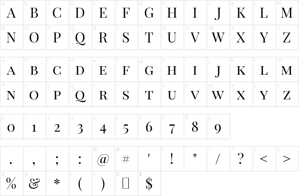
Playfair is a transitional design. In the European Enlightenment in the late 18th century, broad nib quills were replaced by pointed steel pens as the popular writing tool of the day. Together with developments in printing technology, ink, and paper making, it became fashionable to print letterforms of high contrast and delicate hairlines that were increasingly detached from the written letterforms. This design lends itself to this period, and while it is not a revival of any particular design, it takes influence from the designs of John Baskerville and from ‘Scotch Roman’ designs.
This typeface was initially published in 2011, and had a major update in 2017. Being a Display (large size) design in the transitional genre, functionally and stylistically it can accompany Georgia or Gelasio for body text. It was succeeded in 2023 by the complete Playfair design, which as a variable font includes body text designs in the optical size axis.
This is the Small Cap sibling family to the main Playfair Display family. The main family downloaded font files include a full set of small caps, common ligatures, and discretionary ligatures.
The Playfair project is led by Claus Eggers Sørensen, a type designer based in Amsterdam, Netherlands. To contribute, see github.com/clauseggers/Playfair-Display

| File name | File size | File type | Options |
|---|
| PlayfairDisplaySC-Black.ttf | 133 KB | Font File | download |
| PlayfairDisplaySC-BoldItalic.ttf | 130 KB | Font File | download |
| PlayfairDisplaySC-Italic.ttf | 125 KB | Font File | download |
| PlayfairDisplaySC-Bold.ttf | 135 KB | Font File | download |
| PlayfairDisplaySC-BlackItalic.ttf | 131 KB | Font File | download |
| PlayfairDisplaySC-Regular.ttf | 131 KB | Font File | download |
| OFL.txt | 4 KB | Text File | view |
